Web design I
Mobile compatibility and uniform design for a Zendesk help center.
Zendesk help center
(I acknowledge this work reflects the time that it was done and some of the information may have been updated since that time.)
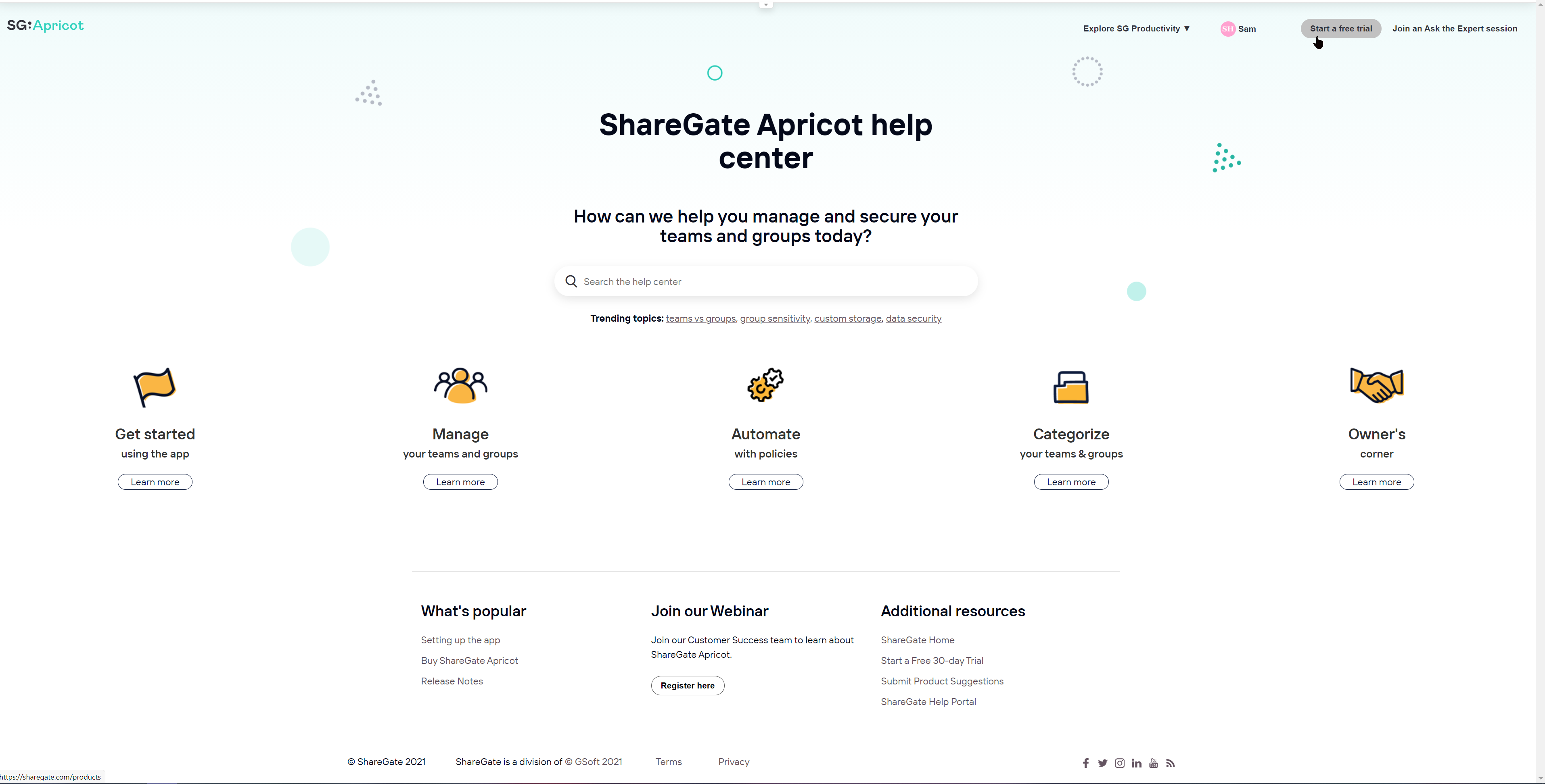
While leading the content creation for the ShareGate Apricot help center [sic.], it became obvious to me that the help center experience was not as uniform—and did not display as well across divices of different size—as it could be.
I hold a strong belief that modern users “see” mistakes and inconsistencies very clearly. We have an expectation that our technology adapts easily and fluidly across all our viewing devices. So, ultimately, I became inspired to do some frontend web development to mitigate some of the issues.
The biggest challenge I faced during this project was the 3000+ lines of legacy code that existed in the CSS. Make one small change, and a very random page could crash. Make a large deletion and you might crash the entire help center for 9 and a half minutes (or so one might say, if that happened to them). Regardless, this was a great exercise in how to combine existing Bootstrap knowledge with CSS knowledge, while adapting to the puzzle that was the existing code. And how to problem solve.
Outcome
After some work:
- The header now displays with uniform font, weight, and button types.
- The categories now span the entire view.
- The page is responsive across a collapsing view.
- Elements no longer lay over one another when displayed on smaller screen sizes.
I then replicated this across the ShareGate Desktop and ShareGate help landing pages… and made sure to maintain a very clean and human-readable code so that someone other than myself would be able to replicate this work in the future!
Before
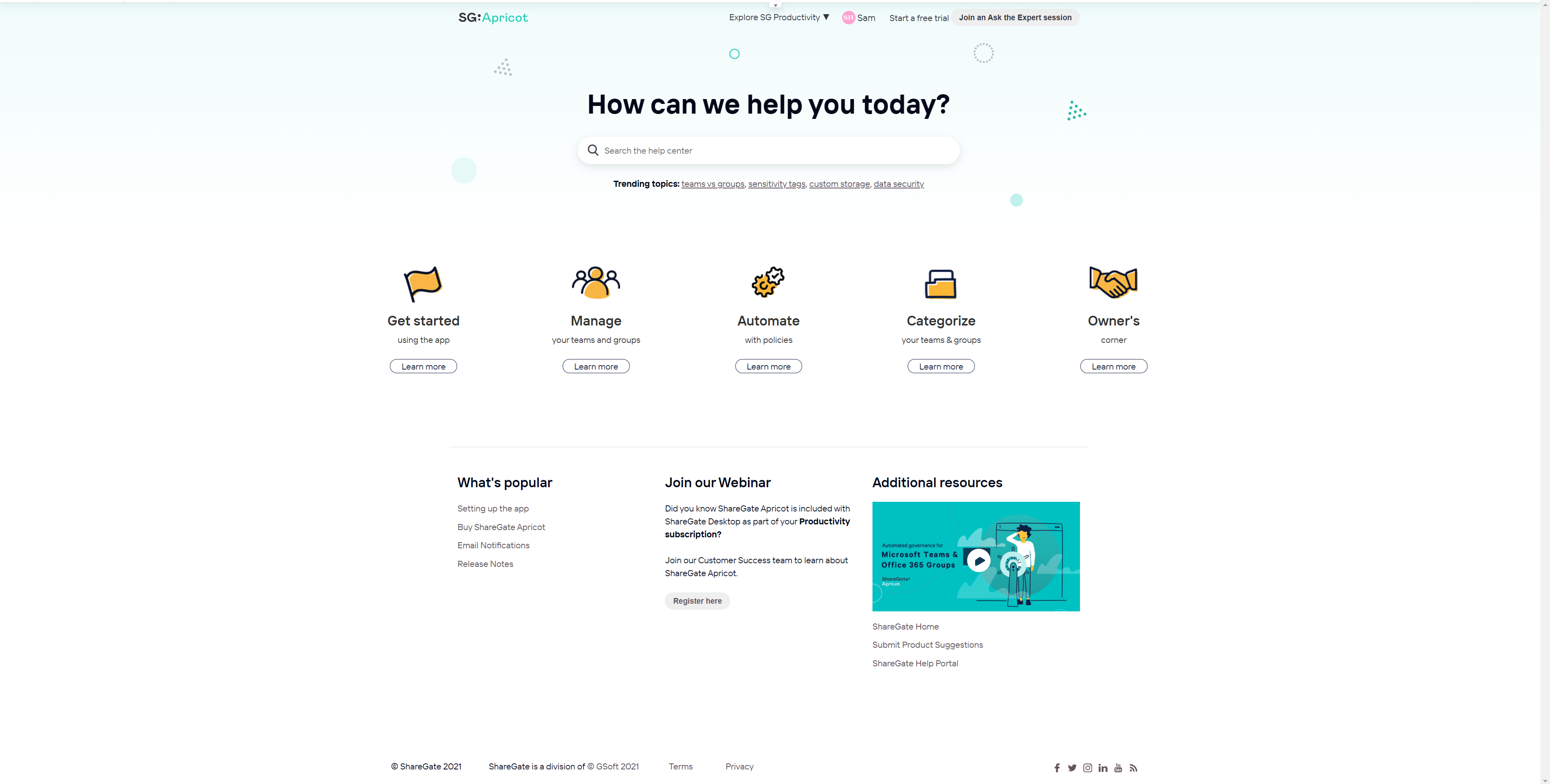
After