Web design III
An experiment on the relationship between Sphinx and custom CSS.
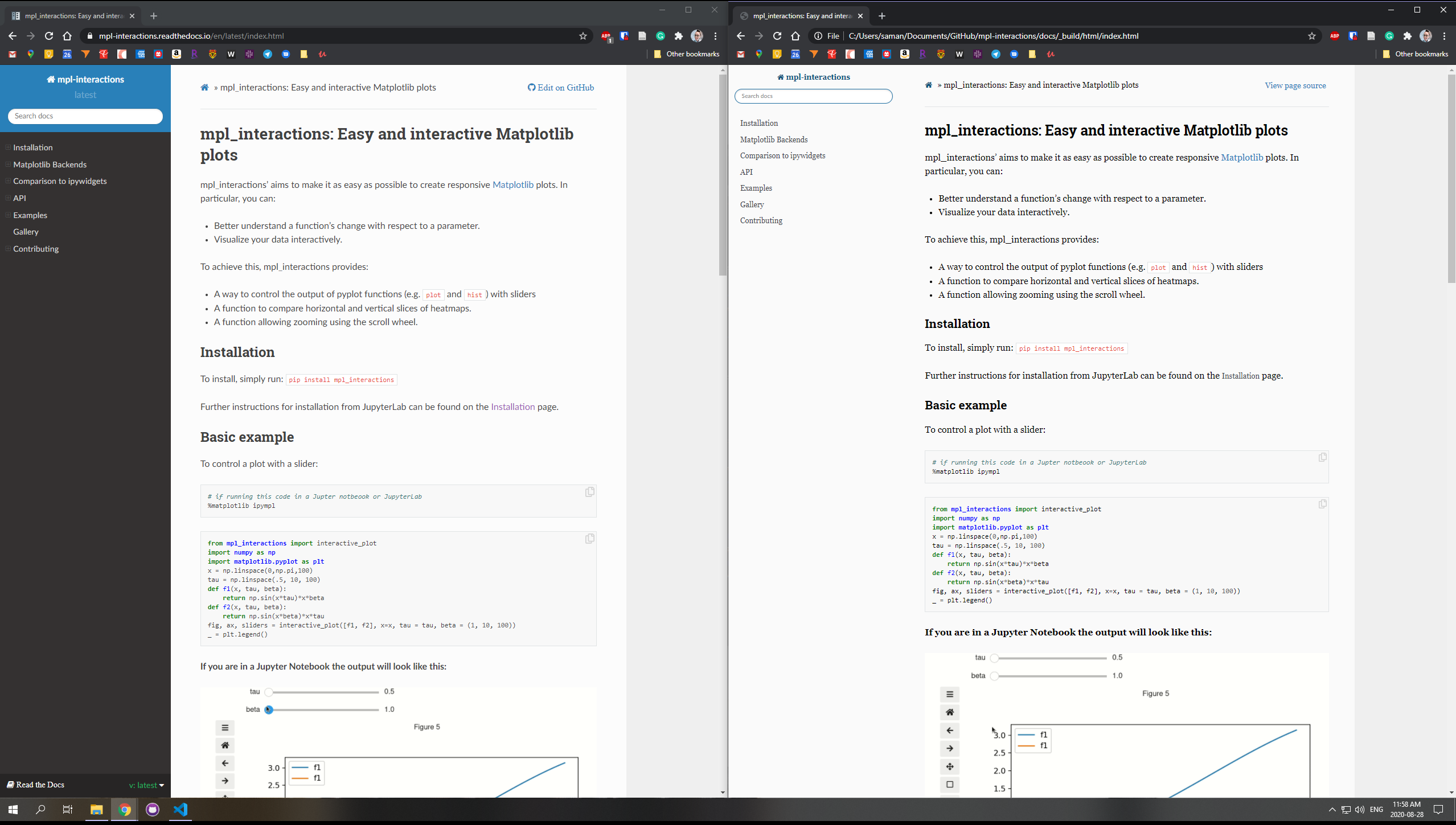
mpl_interactions web design
This project had originally been documented using Sphinx, and hosted through Read the Docs. The first phase of documentation included general page creating, with a focus on installation, examples, and functionality. As the tool’s popularity grew it was important to update the web design. Below is a documentation process for adding CSS styling to Sphinx documentation:
Basic process
- Begin in the
docsfolder, go to the_staticfolder. - Create a new folder called
css. - In the
cssfolder, create a file calledcustom.css. - Make additions and stylistic changes here, then save when complete.
Once finished:
- In the
docsfolder select the file calledconf.py. - Under the header General configuration there is a line titled
html_static_path = ['static']. - Add a new line underneath and enter the command
html_css_files = ['css/custom.css']. - Save
conf.py.
Sphinx documentation allows you to add additional CSS snippets which replace the built-in design. For example, if you choose to adjust the background-color of a particular section, the small code snippet will then override the original background style. This allows you to personalize the pages without requiring a complete code or stylistic overhaul.
Reference
Adjustments made to the page
Colours: The library provides additional features for Matplotlib plots. To honour their connection, the colour palette begins with #11557C, the Matplotlib cover art tone. The navigation font—which appears both on the side bar and the bottom of the landing page—is a deep grey for soft contrast with the text body.
Background: Sphinx has inherent blank-space background colour. To soften the drastic colour differences, the new background (#FAFAFA 250) is a tone of the margin grey (#EFEFEF RBG 239).
Fonts: The sans-serif font was changed to the serif font Georgia. This font is intended to be legible even on small or low resolution screens, perfect for the wide variety of computer screens the intended audience might use.